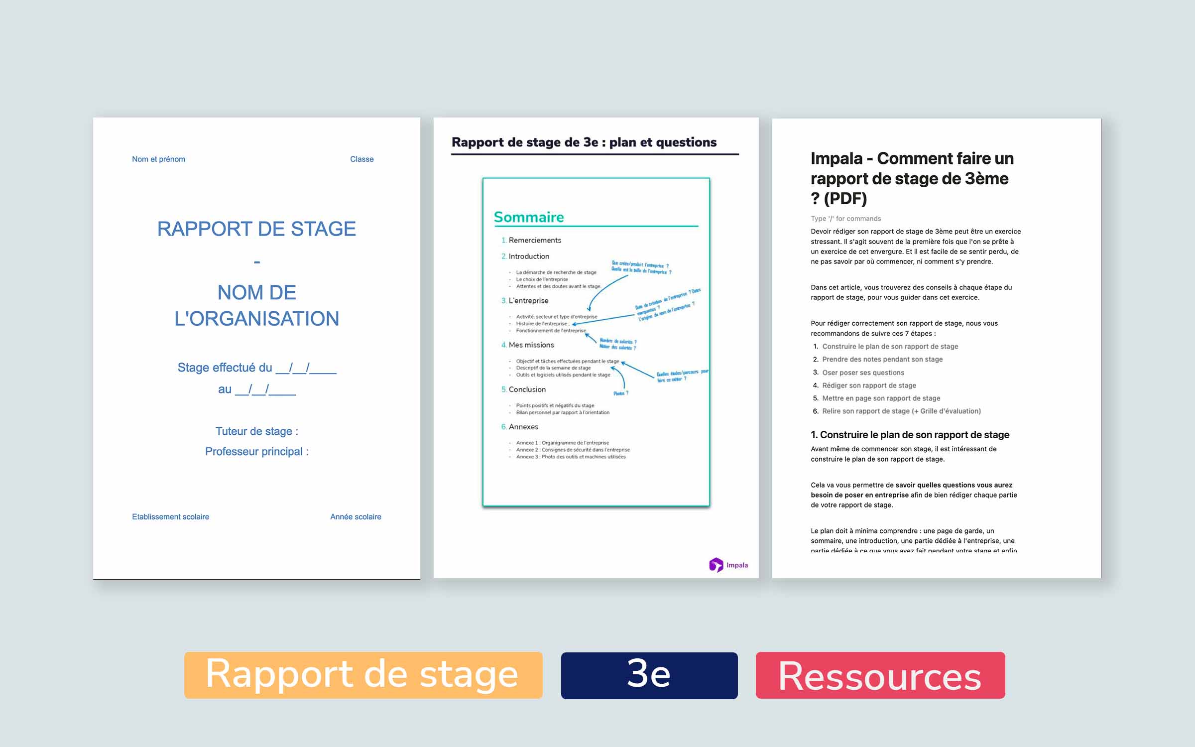
Exemple De Page De Garde D'un Rapport De Stage 3eme
Okay, so picture this: I'm rummaging through a pile of old papers in my attic. Dust bunnies are attacking, my nose is itching like crazy, and suddenly – BAM! – I unearth my 3ème stage report. The cover? A tragic mess. Think Comic Sans, a blurry photo copied from somewhere, and a font size that screamed for attention. *Cringe*. That, my friends, is exactly what we want to avoid for *your* stage report. Let's dive into how to create a cover page that screams "professional" (in a chill, cool-kid kind of way, of course).
Why Bother with a Nice Cover Page?
Seriously though, why stress over something that's *just* a cover? Well, it's the first impression! Think of it as your report's dating profile picture. You wouldn't post a selfie with bad lighting, would you? (Okay, maybe you would, but that's a different story.) Your cover page sets the tone, tells your teacher or evaluator you've taken the internship seriously, and shows you pay attention to detail. And trust me, those little things add up.
The Essential Ingredients of a Killer Cover Page
Alright, let's get down to the nitty-gritty. Here’s what *needs* to be on your 3ème stage report cover page:
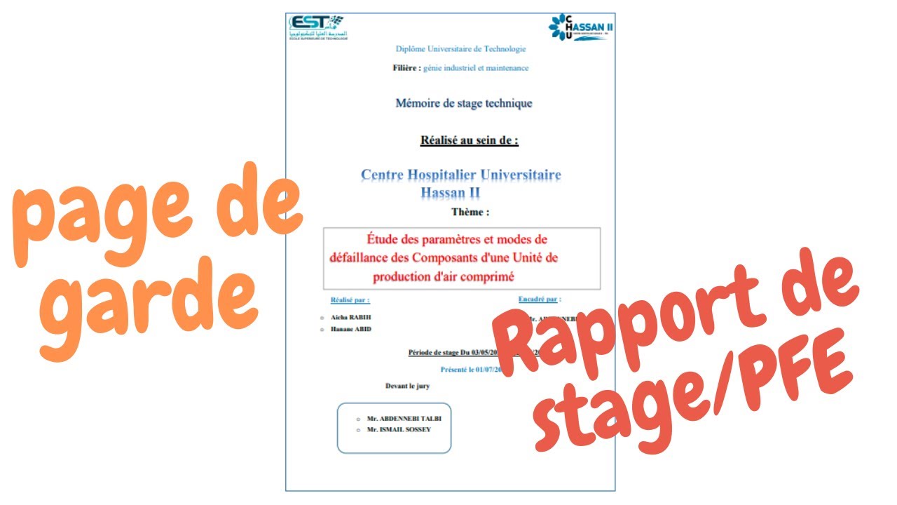
- Nom et Prénom: Obvious, but needs saying. Make sure it's legible!
- Classe: Let everyone know you're a star student in 3ème! (Even if you're not, fake it 'til you make it, right?)
- Nom de l'établissement scolaire: The prestigious institution you attend (or, you know, just your school).
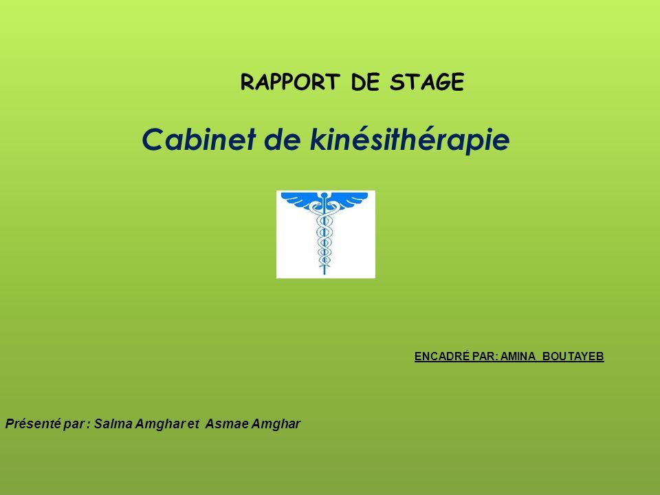
- Nom de l'entreprise/organisme d'accueil: Where did you intern? Make sure to spell it correctly! Double-check! *Triple-check!*
- Période du stage: Dates! From start to finish.
- Année scolaire: Because context matters.
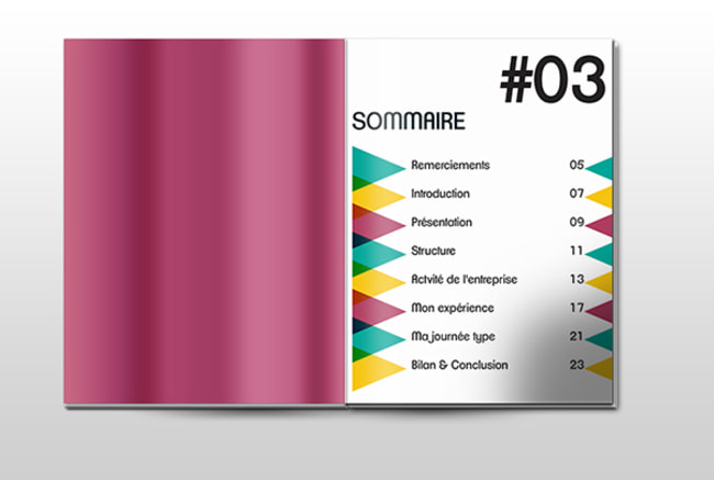
- Titre du Rapport de Stage: Something creative and descriptive. Think beyond "Rapport de Stage" (unless you’re feeling particularly minimalist… but let’s be honest, you’re probably not). Maybe something like "Découverte du monde de [Your Industry]" or "Immersion dans [Company Name]: Un Stage Réussi".
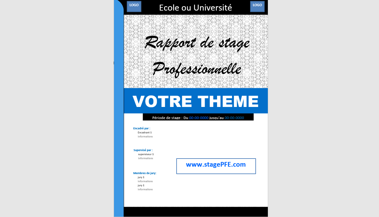
Optional (But Highly Recommended) Extras
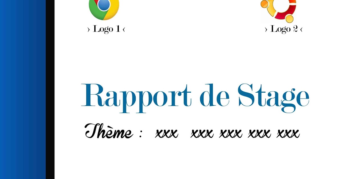
- Logo de l'entreprise: Find a decent quality image online. But for the love of everything holy, don't stretch it or make it pixelated!
- Une image pertinente: A subtle image related to the industry or company can add a nice touch. Think professional, not distracting. *Avoid clip art at all costs!* Seriously.
Design Tips for a Visually Appealing Cover Page
Now for the fun part: making it look good! Here are some pointers:
- Font Choice: Stick to classic, readable fonts like Arial, Times New Roman, Calibri, or maybe even something a little more modern like Open Sans. Avoid anything too fancy or difficult to read. (We're looking at you, Comic Sans… again!)
- Font Size: Use different font sizes to create a hierarchy. Your title should be the largest, followed by your name, etc.
- Color Scheme: Choose a color scheme that is professional and reflects the tone of your report. Consider using the company's colors (if appropriate). *Less is often more!*
- Layout: Keep it clean and balanced. Don't cram everything into one corner. Use white space effectively.
- Proofread!: Seriously, nothing undermines a good design like a typo. Get a friend (or your mom) to proofread it for you.
Pro Tip: Use a tool like Canva (it's free!) to create a visually appealing cover page without needing any design skills. They have tons of templates to get you started.
Example Time! (Sans Vraiment...)
Instead of giving you a specific example, I want to encourage you to be creative! Look at professional websites and documents for inspiration. Think about the company you interned with – what's their brand? What kind of image do they project? Try to mirror that in your cover page.
The most important thing is to show that you've put thought and effort into your report. A well-designed cover page is a great way to do just that. Good luck, and may your internship reports be forever free of Comic Sans!
And remember, you got this! Allez, on se lance!