Abstract Page De Garde

Ah, la "page de garde"… Sounds intimidating, doesn't it? A term plucked straight from dusty tomes and academic presentations. But let's ditch the formality, shall we? Forget those stuffy visions of required reading; we're diving headfirst into the wonderfully abstract side of the page de garde.
Think of it as a visual appetizer, a tantalizing glimpse of the masterpiece (or, you know, meticulously crafted report) that lies within. But this appetizer doesn't have to be beige and bland. We're talking vibrant colors, intriguing textures, and a dash of je ne sais quoi.
What is an Abstract Page de Garde, Anyway?
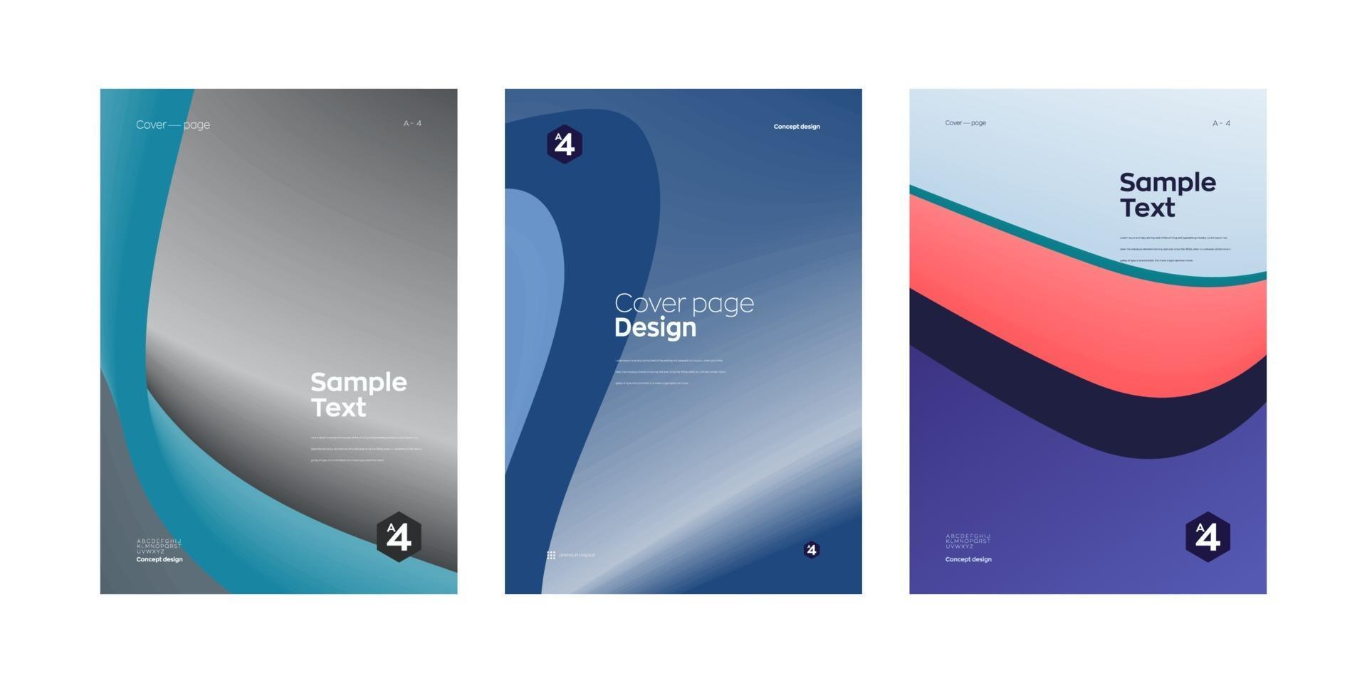
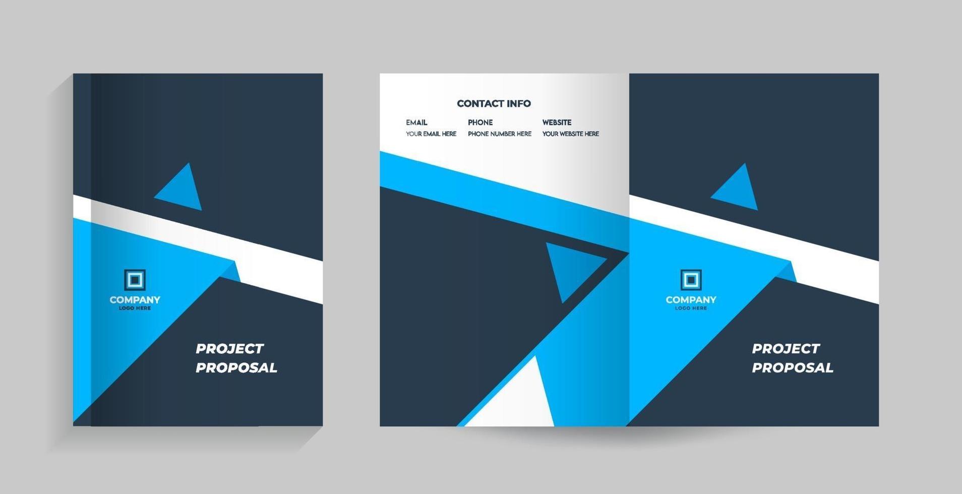
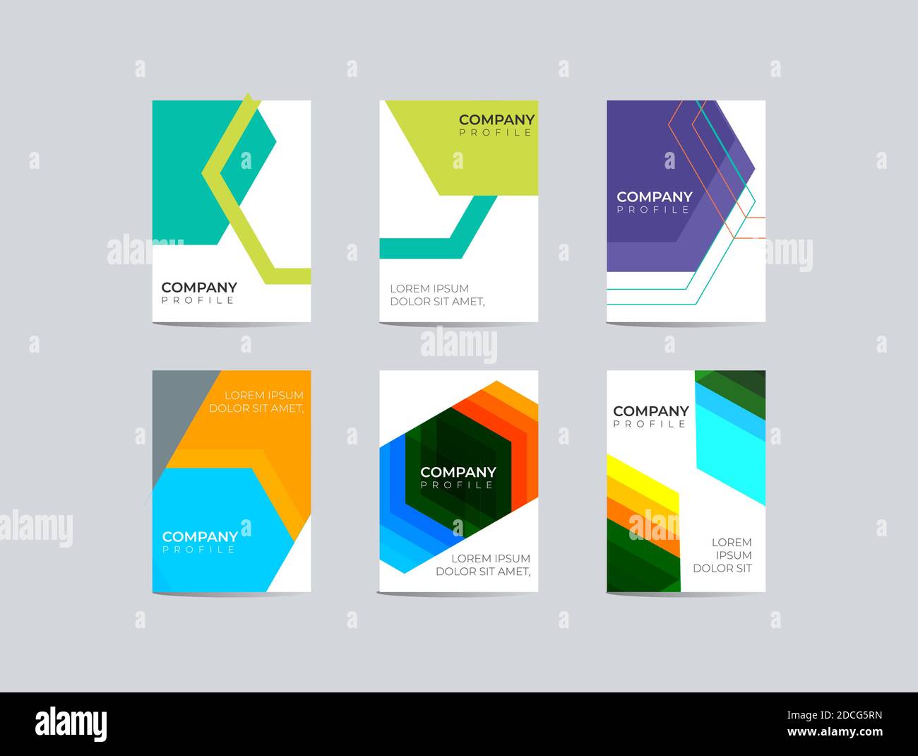
Essentially, it's a title page with a twist. Instead of just slapping on the title, author, and date (yawn!), you incorporate abstract art elements. This could mean:
- Geometric shapes swirling in a delightful dance.
- A bold splash of color that evokes a specific mood.
- Textural explorations using mixed media.
- Subtle patterns that hint at the document's core theme.
Think less "corporate memo," more "modern art gallery." We’re channeling our inner Kandinsky, people!
Why Bother Going Abstract?
Aside from looking absolutely fabulous? Well, an abstract page de garde can actually be incredibly effective.
- It grabs attention: In a sea of predictable title pages, yours will stand out. Think of it as the perfectly accessorized outfit at a party.
- It sets the tone: The colors, shapes, and textures you choose can subtly communicate the mood and subject matter of your document. A cool palette might suggest a serious, analytical report, while vibrant hues could hint at a creative, playful project.
- It sparks curiosity: An intriguing abstract design can pique the reader's interest and encourage them to delve deeper. It’s like the opening scene of a captivating film.
- It showcases your creativity: Let’s face it, a well-executed abstract page de garde is a statement. It tells the world (or at least your professor) that you're not afraid to think outside the box.
Practical Tips for Creating Your Own Masterpiece
Feeling inspired? Excellent! Here's a dose of practical advice to help you on your artistic journey:
- Start with a concept: What's the main theme of your document? What feeling do you want to evoke? Use this as a starting point for your design.
- Embrace color psychology: Colors have a powerful impact on our emotions. Do a little research to understand the psychological associations of different hues. For example, blue often conveys trust and stability, while yellow evokes happiness and optimism.
- Explore different mediums: Don't limit yourself to digital tools. Experiment with paint, collage, photography, or even found objects.
- Keep it simple: Less is often more. Avoid overcrowding your page with too many elements. A clean, minimalist design can be just as effective as a complex one.
- Consider typography: Choose a font that complements your abstract design. A bold, modern typeface can add a touch of sophistication, while a handwritten font can create a more personal feel.
A Touch of Culture & Fun Facts
The concept of abstract art has deep roots in art history, evolving from movements like Cubism and Surrealism. Think Picasso’s fragmented forms or Miró's whimsical shapes. These artists paved the way for us to embrace the beauty of non-representational art.
Did you know that the first fully abstract painting is often attributed to Wassily Kandinsky, who created "Composition VII" in 1913? It's a whirlwind of colors and shapes, a true masterpiece of abstract expression.
And speaking of France, the term "page de garde" itself highlights the French appreciation for aesthetics and attention to detail. It's a subtle reminder that even the most functional documents can benefit from a touch of artistry.
One of the most crucial elements in an abstract page de garde is the proper usage of negative space. The empty area helps the other elements to pop and gives a better sense of balance. It is similar to how the silence between musical notes allows the melody to resonate with greater impact. A simple background is as important as the foreground!
A Daily Dose of Abstraction
The beauty of abstract art lies in its open-endedness. There's no right or wrong interpretation, only personal experiences and emotional connections. So, next time you're feeling overwhelmed or uninspired, take a moment to appreciate the abstract patterns in your everyday life – the way sunlight filters through the leaves, the random arrangement of objects on your desk, or the ever-changing shapes of the clouds. You might just find a new perspective, a fresh idea, or simply a moment of unexpected joy. Embrace the chaos, find the beauty in the unexpected, and inject a little abstraction into your life. After all, isn’t life itself a bit of an abstract masterpiece?